Langfuse
Credits
Building for developers tired of marketing websites.
Langfuse
Website, Engineering
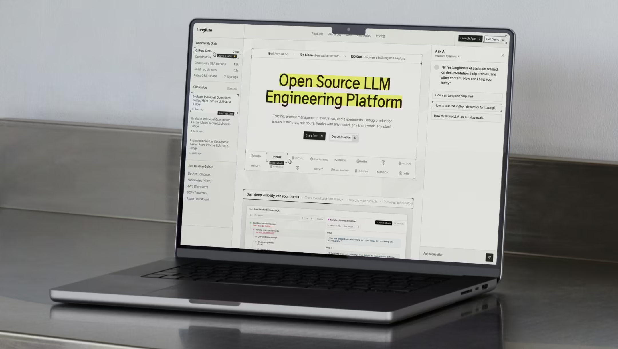
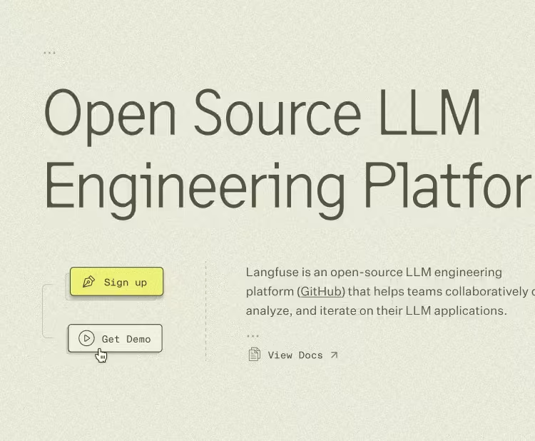
Langfuse is an open-source LLM engineering platform that had quietly become a household name for people developing AI applications and agents. Heck, when one of our teammates mentioned the project at home, her husband lit up: that Langfuse, the one he opens every day.
Anyway, Langfuse combines observability, prompt management, evaluation, and much more to help teams collaboratively debug, analyze, and iterate on their LLM applications.
The product, and the love it earned from the community, had outgrown its online presence. Lined up against better-funded players, Langfuse kept reading as the scrappier option, when it was anything but. Our goal was to close that gap.
The plot twist
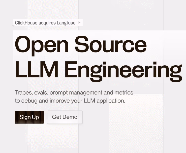
We’d barely started when Langfuse was acquired by ClickHouse. Had the founders been chasing an exit, that might have ended the project then and there, but luckily the reason was different. The Langfuse team realized they could move faster inside ClickHouse, with the founders staying on and the mission unchanged, so the work carried on. It landed right before our early creative exploration phase, and we included treatments that nod to the ClickHouse brand.
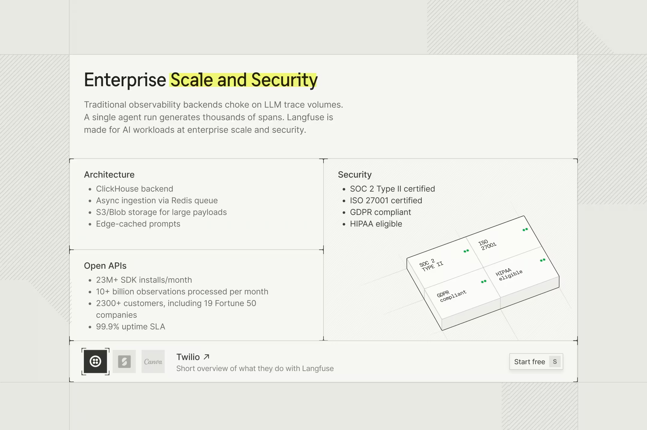
Precision you can feel
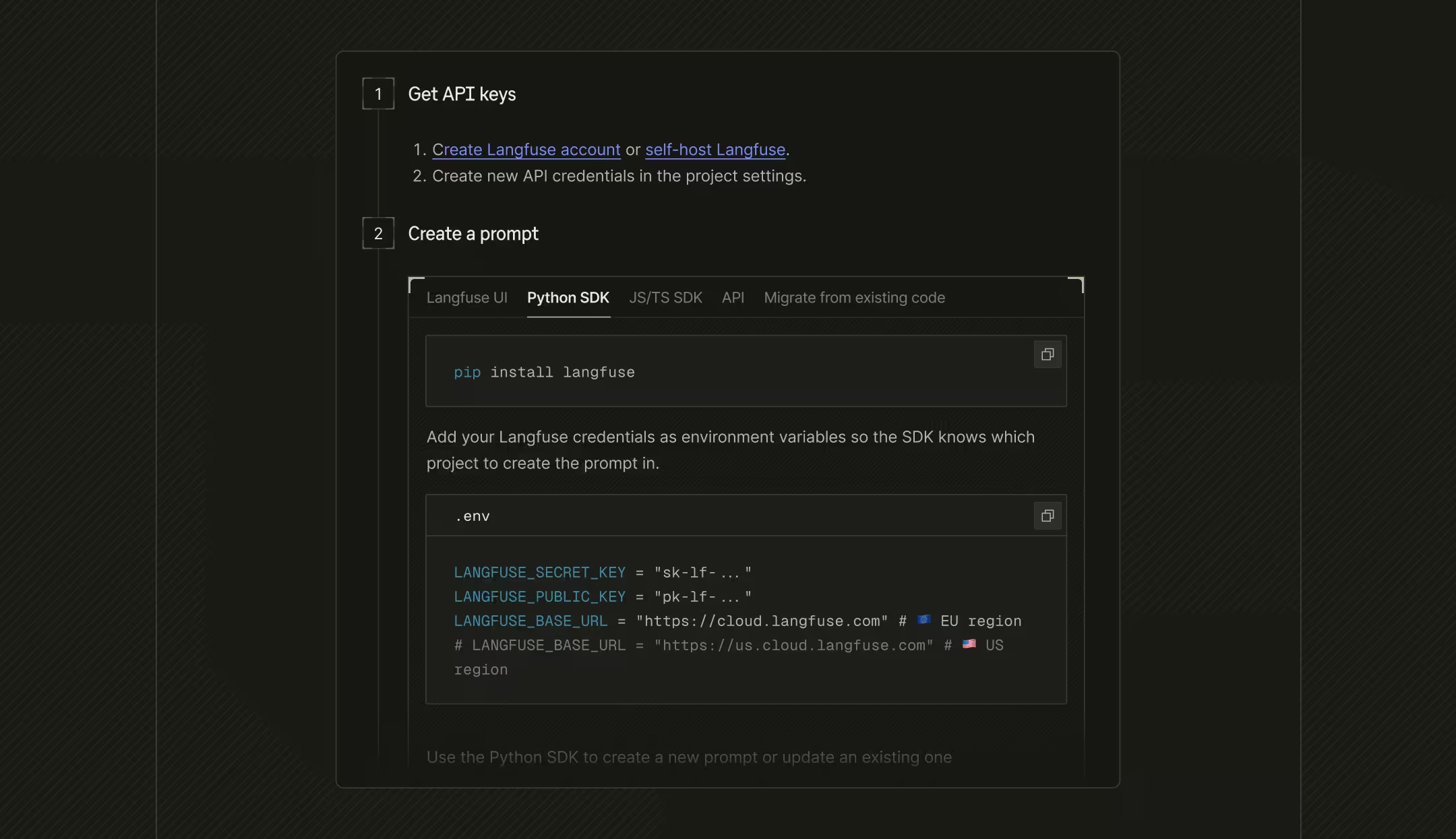
A millimeter-grid pattern runs faintly beneath everything, borrowed from technical blueprints and graph paper, the surfaces engineers actually work on. It’s barely there, but it sets the tone: this is a tool measured to the millimeter.
It matches the boxy layout that drives information density. Axonometric visuals build on that, carrying the sense of something engineered, tangible, dimensional, without tipping into decoration.
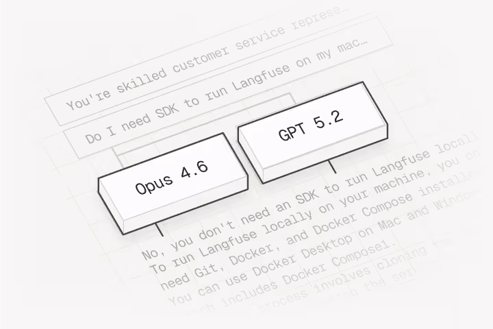
Playground
Test prompts on real production inputs and compare models side-by-side.
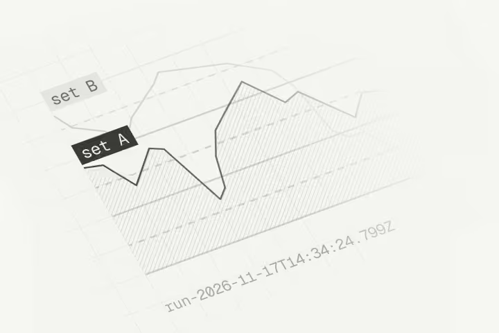
Experiments
Run experiments on datasets, compare prompts and configs with statistics.
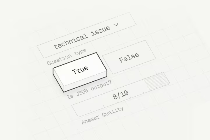
Human Annotation
Queue traces for review and turn feedback into labeled datasets.
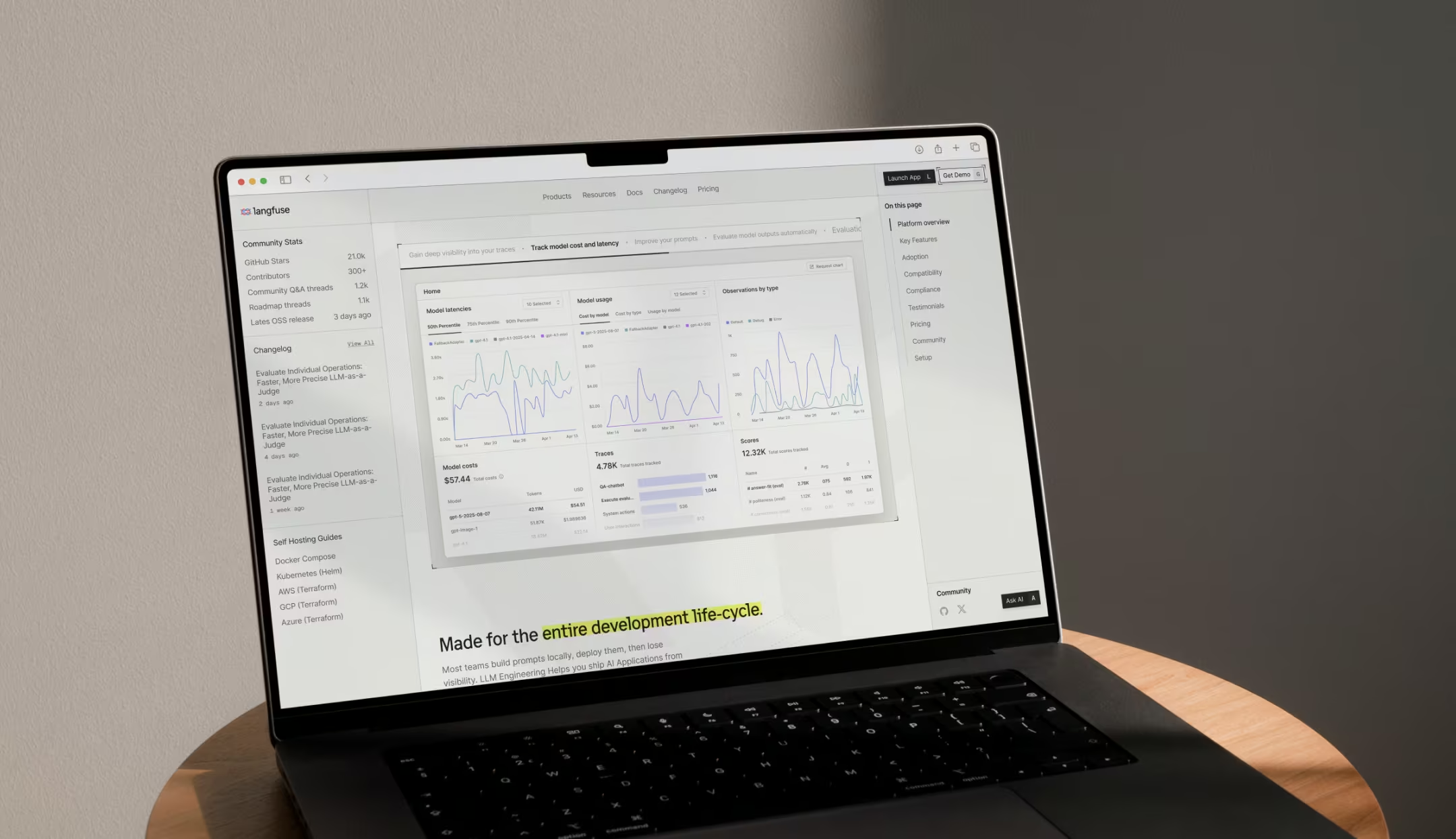
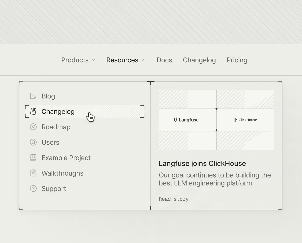
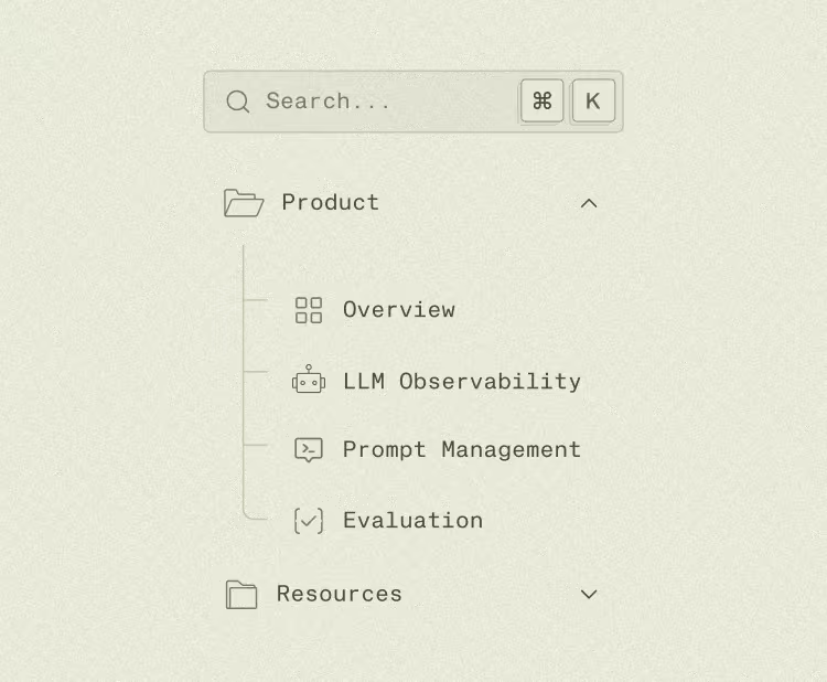
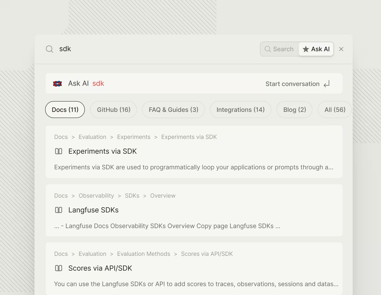
Docs as the whole experience
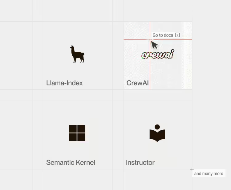
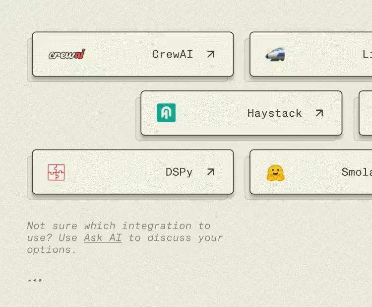
The initial website was already built on top of a docs framework. We doubled down on that approach, migrating from Nextra to Fumadocs along the way, because what looked like a makeshift shortcut was actually the smart thing to leverage. The marketing site and developer docs became one continuous surface: you explore the company the way you’d browse an API reference.
It closes the loop with a look and feel built around precision for a technical audience. The payoff was twofold. The layout, two side panels framing a dense central column, delivers the technical, information-rich feel. And underneath it sits a real system of reusable components Langfuse can recombine to spin up a new page or section.
We loved working with Altalogy. They understand the domain we’re in and invested tons of effort alongside our team to get it right. Always pushing back when quality was at stake and demonstrating superb attention to detail. We’re looking forward to working together again.