
Rollups
Credits


Spinning out AngelList's fundraising tool for founders into a brand of its own.
Rollups
Brand, web design and engineering


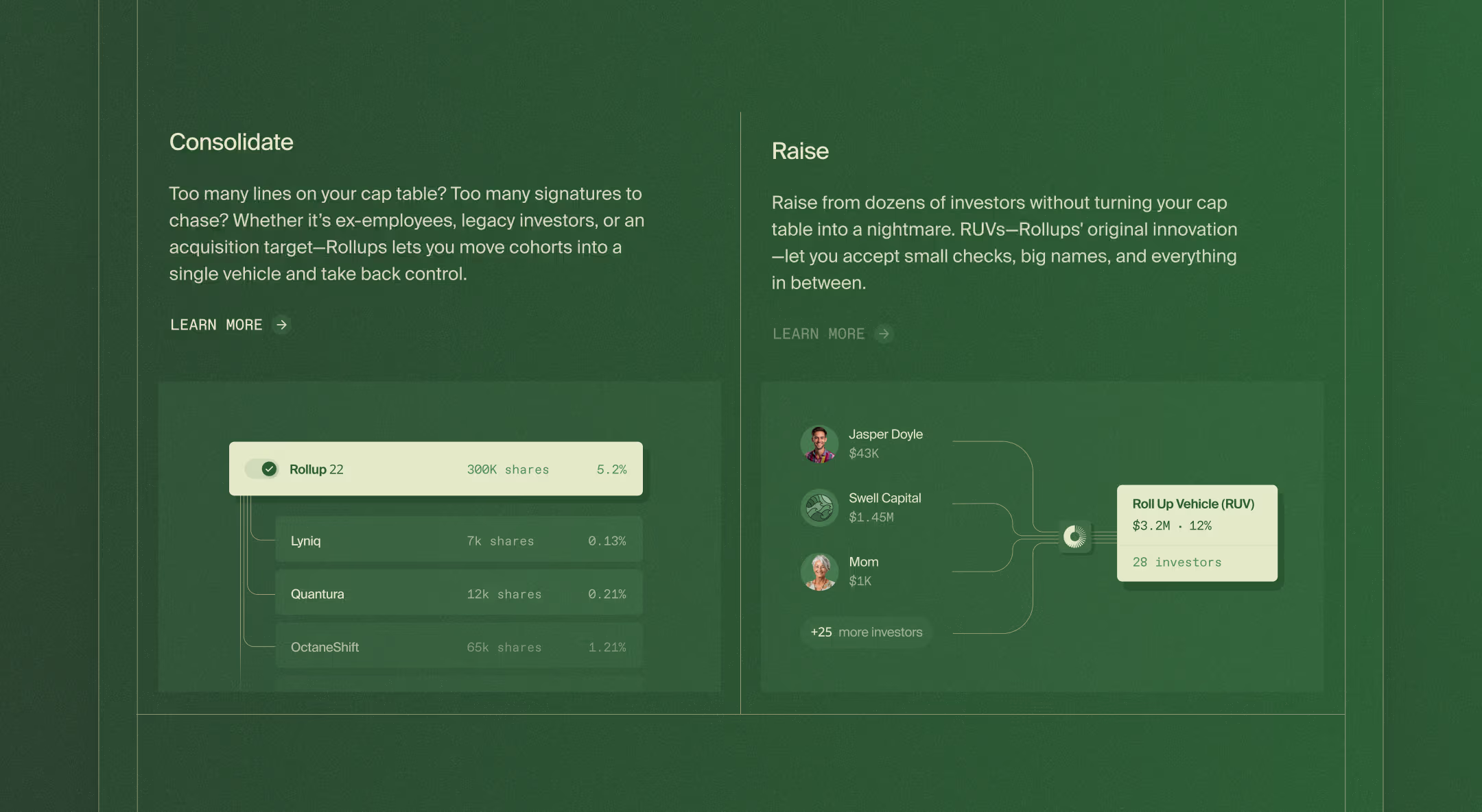
RUV stands for Roll Up Vehicle. It’s a way for founders to raise from a bunch of small investors while keeping them as one line on the cap table. AngelList has had RUVs in its tool suite for a while, but its main focus is VC funds, so RUVs stayed slightly buried and most founders never found them. Dan and Sumukh’s idea was to spin them out into a separate brand: don’t tie it to AngelList, and avoid the templatish fintech/SaaS feel.
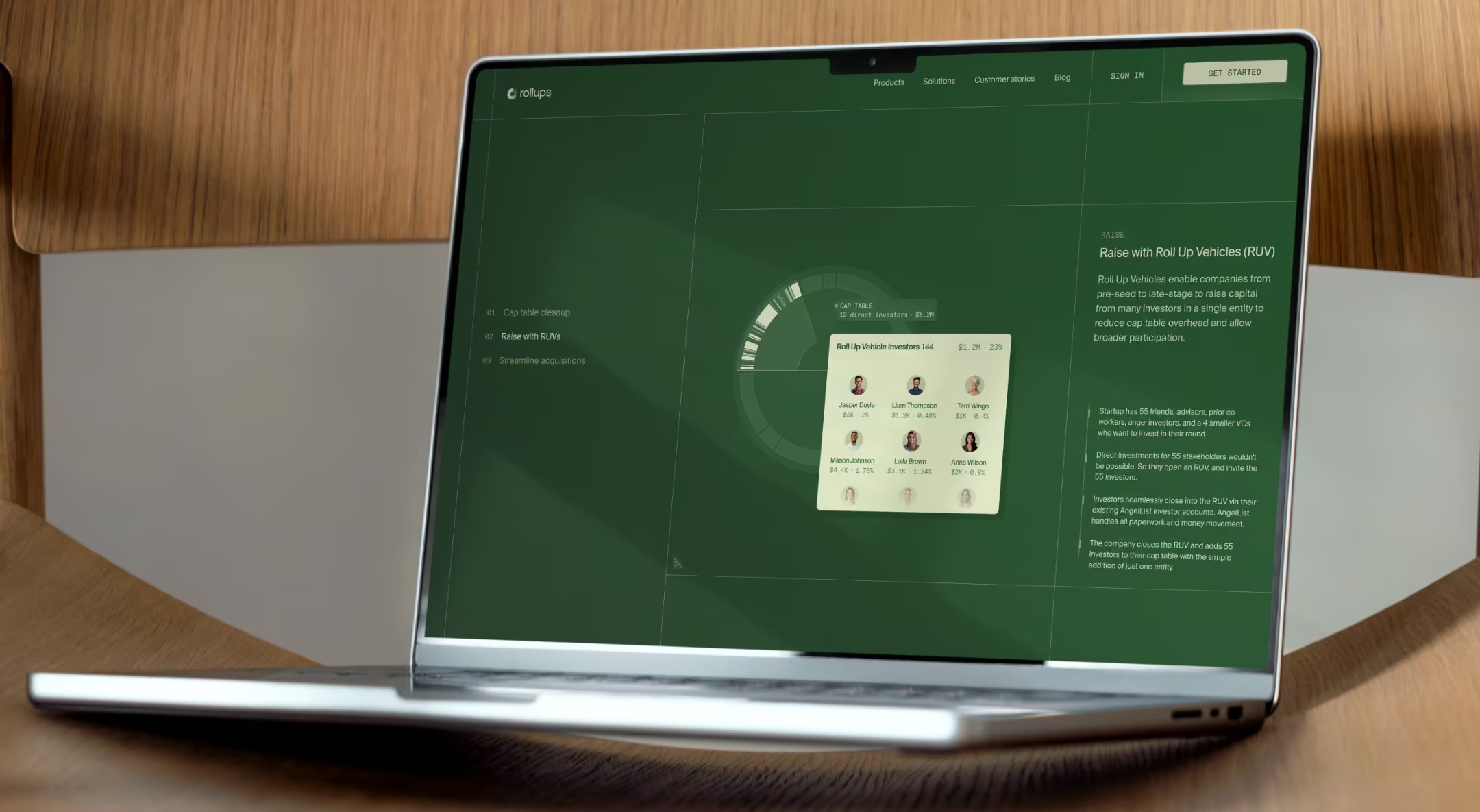
Because we were building the online presence from scratch, we had room to explain clearly what Roll Up Vehicles are. Awareness of the solution was still low, so the goal was to show founders why a better way to manage their cap table was worth their attention.
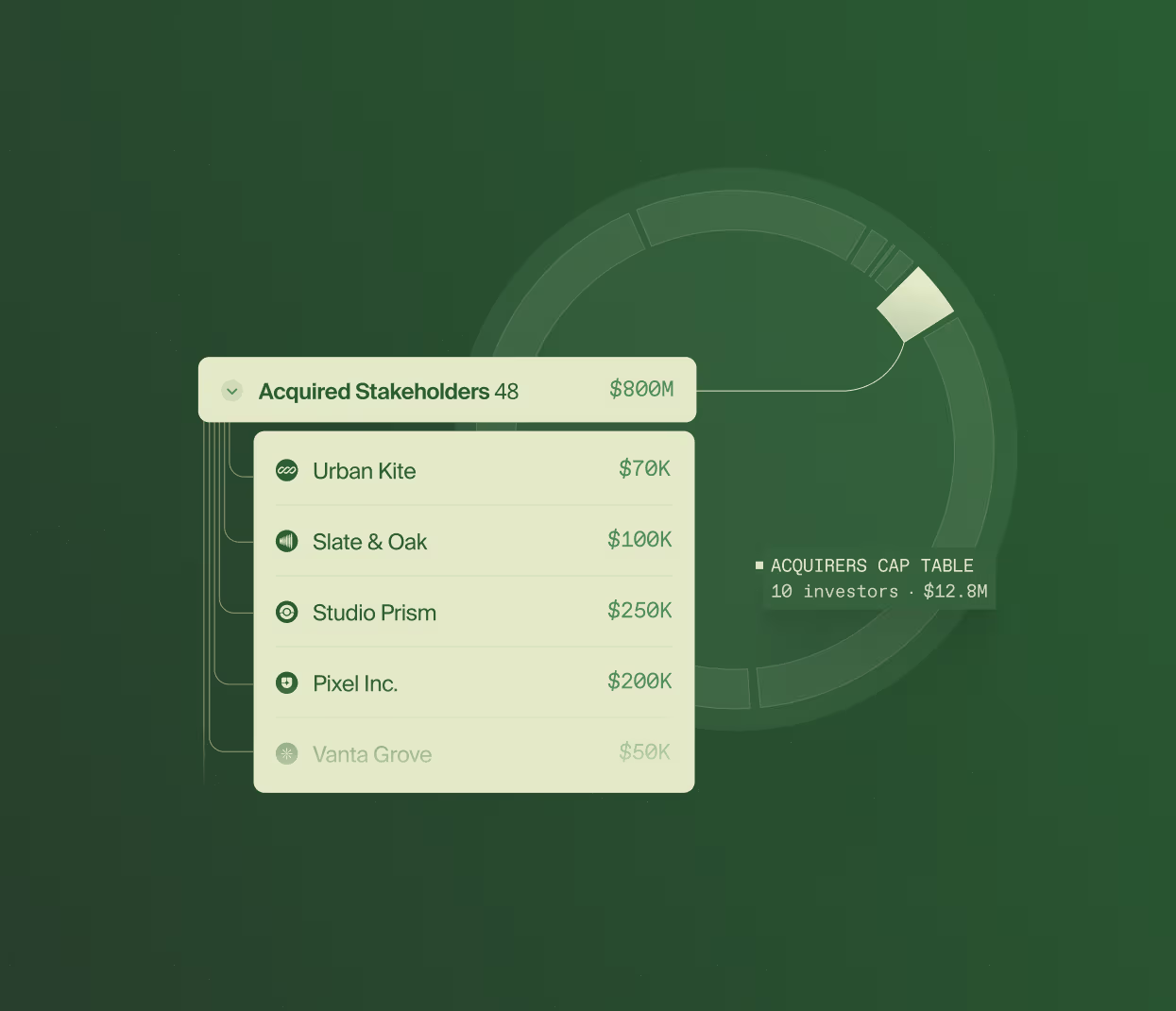
The name itself, plus the mechanics of rolling many items into one, begged for a visual representation, ideally an animated one. The kind that does enough of the work that a founder gets RUVs before reading a word of the copy.
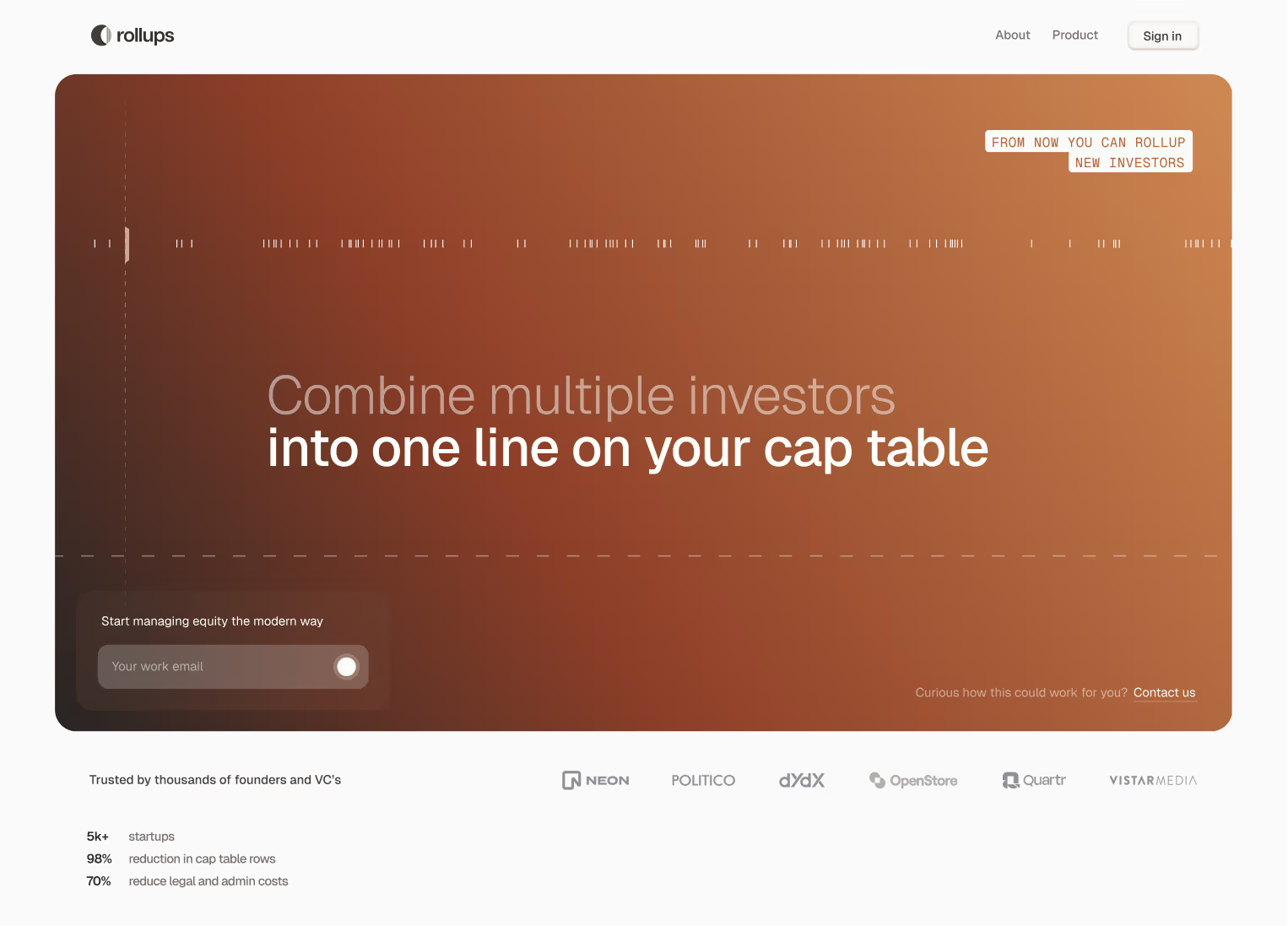
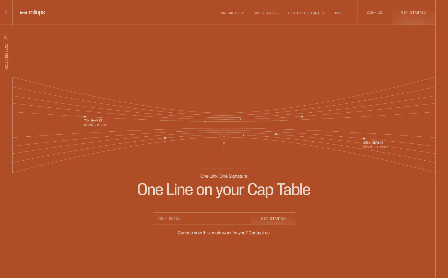
Color flip
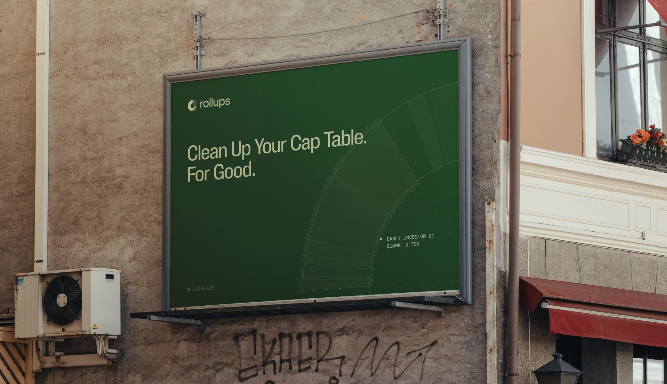
A few words on the aesthetic we were aiming for: high-end and experimental, but also technical and raw. Nothing decorative, nothing that dates in a year. Closer to precision engineering than to whatever’s trending.
We’d worked out the entire visual language in shades of orange, and then, almost as an afterthought, we decided to challenge that and landed on money green instead.
No white sections anywhere, which was deliberate. Everything sits solid and a little heavy, like the whole thing was cut from one block of the same material.

Complexity, tamed
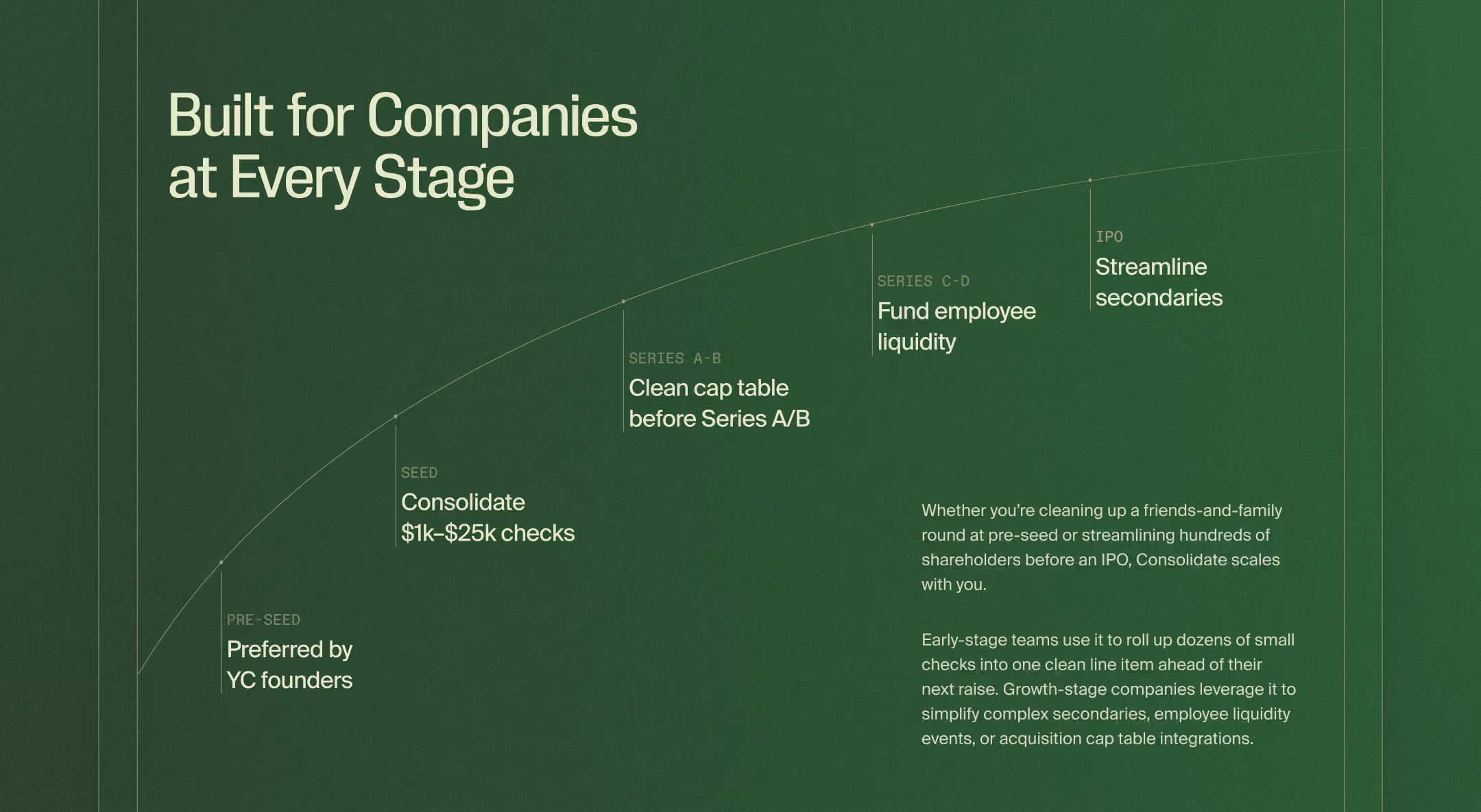
Every element on the page pushes the same idea: order coming out of complexity. The grid lines are sharp, the structure is exposed, and the whole thing ends up feeling like a blueprint rather than a marketing wrapper around the product. You’re looking at how the thing works, not a pitch for it.
The overall website motion is subtle, used mostly where it makes the mechanics of Rollups clearer.
ControlOS: A Brand Within a Brand
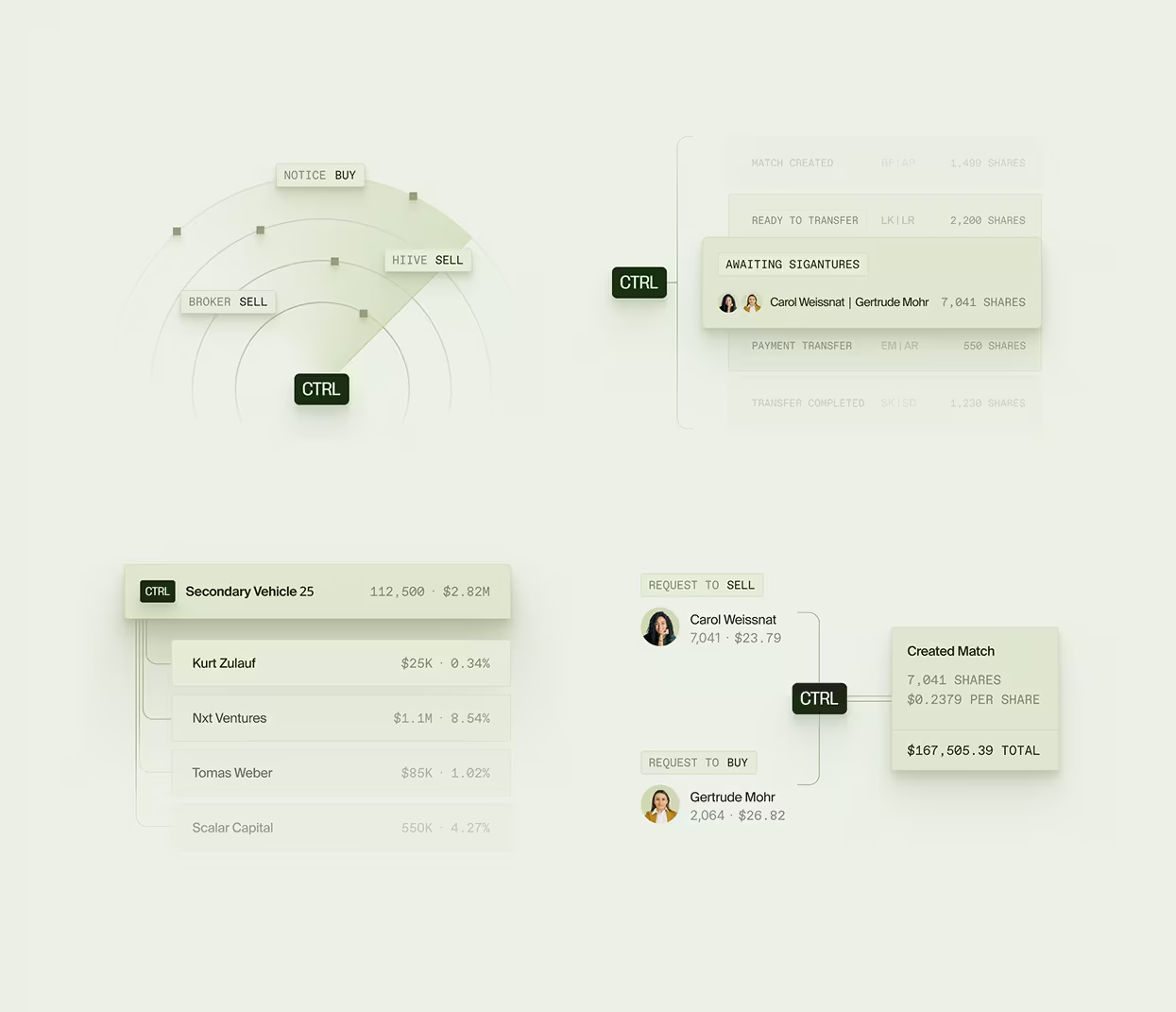
A year later we got back together with the Rollups team for a new product, ControlOS. It’s a separate sub-product for managing secondary market activity: scanning public marketplaces, routing buyer and seller interest into a private pipeline, automating transfer approvals, and pooling secondary buyers into one vehicle.
It needed its own identity, but not a clean break from the master brand. The whole problem was calibration. Too similar and it vanishes into the main site with no reason to stand alone. Too different and it breaks the trust Rollups had just built. So rather than reuse the visual system, we gave ControlOS its own look and its own logo, while keeping the UI elements recognizably similar to Rollups (think details like corner radius, typography, and page layouts).
There’s yet another way we signal that ControlOS belongs to Rollups: the move between them isn’t a hard cut. As you cross from the main site into the subpage, the dark green background contracts, pulling in from full-screen to ControlOS’s framed hero while a lighter page opens around it. A handoff, not two disconnected screens. It’s a small bit of motion, but it says what it needs to: same company, similar product, different mode.
What holds the two together isn’t a shared template but a shared discipline. The same raw restraint, the same refusal to decorate, the same instinct to show instead of explain. A different room in the same building, distinct enough to justify itself, consistent enough that you never have to ask whose product you’re looking at.

Altalogy moves fast and obsesses over details. We came to them for their deep expertise in the VC space, and they proved it.